-
Term
Aug - Sep 2025
-
Client
PhoneBox
-
Work Scope
- Brand Identity Refinement
- Brand Guideline
- Package Design
- Email Design
- Motion Design
-
Team
- 1 Project Manager
- 2 Designers
- 2 Content Writers
Creating a cohesive visual system to strengthen PhoneBox’s brand experience
브랜드의 모든 접점을 하나로 잇는 비주얼 시스템 구축
PhoneBox is a Canadian MVNO offering affordable mobile plans and multilingual customer support, primarily serving immigrants, international students, and travelers. With approximately 60% of its user base made up of international students, the brand needed a visual system that feels immediately trustworthy and easy to navigate — for users making decisions in an unfamiliar environment.
PhoneBox는 합리적인 요금제와 다국어 고객 지원을 강점으로 하는 캐나다 기반 MVNO로, 이민자·유학생·여행자를 주요 고객으로 두고 있습니다. 전체 고객의 약 60%가 유학생인 만큼, 낯선 환경에서 통신사를 선택해야 하는 사용자들이 첫 접점부터 신뢰감을 느낄 수 있는 비주얼 시스템이 필요했습니다.
Project Goal
Unifying a fragmented brand into one clear, modern system
파편화된 브랜드를 하나의 명확한 시스템으로
Prior to this project, PhoneBox lacked a consistent visual language across web, email, social media, and packaging. Layouts, type choices, and color usage varied across channels, making it difficult to build a coherent brand impression. The goal was to consolidate these scattered assets into a unified, scalable system — one that could grow with the brand as it expands into new markets.
프로젝트 이전의 PhoneBox는 웹·이메일·소셜 미디어·패키징 전반에 걸쳐 일관된 비주얼 언어가 부재했습니다. 채널마다 레이아웃, 서체, 컬러 사용이 제각각이었고, 이는 일관된 브랜드 이미지를 인식하기 어렵게 만들었습니다. 이 프로젝트의 목표는 산재된 리소스를 하나의 확장 가능한 시스템으로 통합하고, 향후 신규 시장 진출에도 유연하게 대응할 수 있는 기반을 마련하는 것이었습니다.

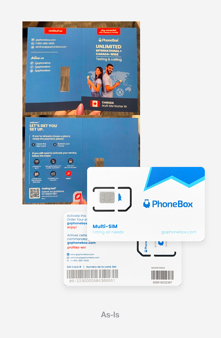
Previous PhoneBox designs for social media, packaging, and email
리뉴얼 이전 PhoneBox의 소셜 미디어, 패키징, 이메일 디자인
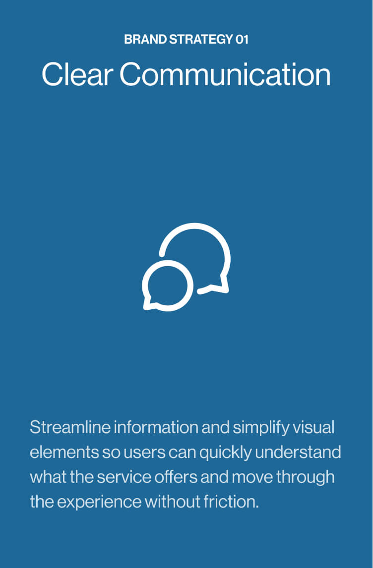
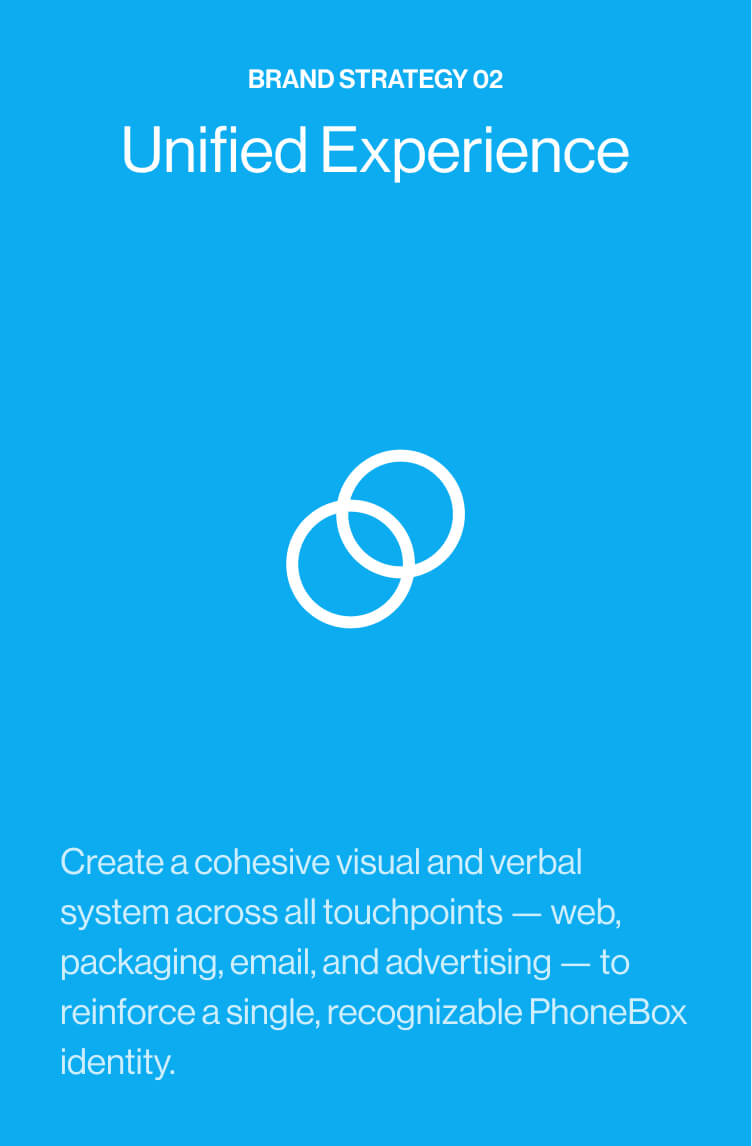
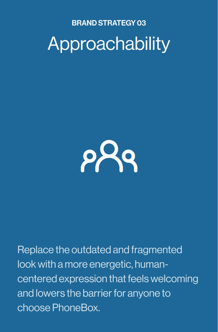
Brand Strategy
Driving clarity, consistency, and approachability across the brand
명확하게, 일관되게, 그리고 더 가깝게
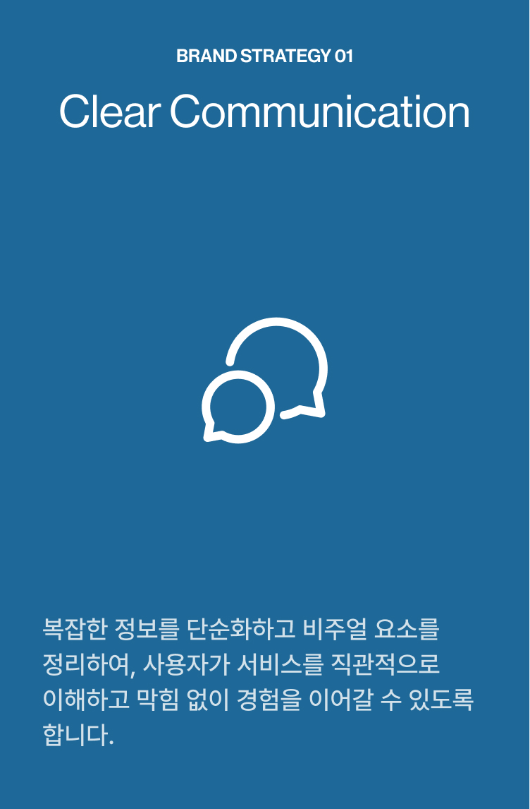
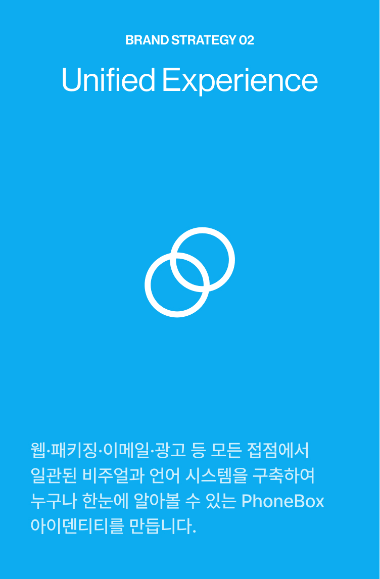
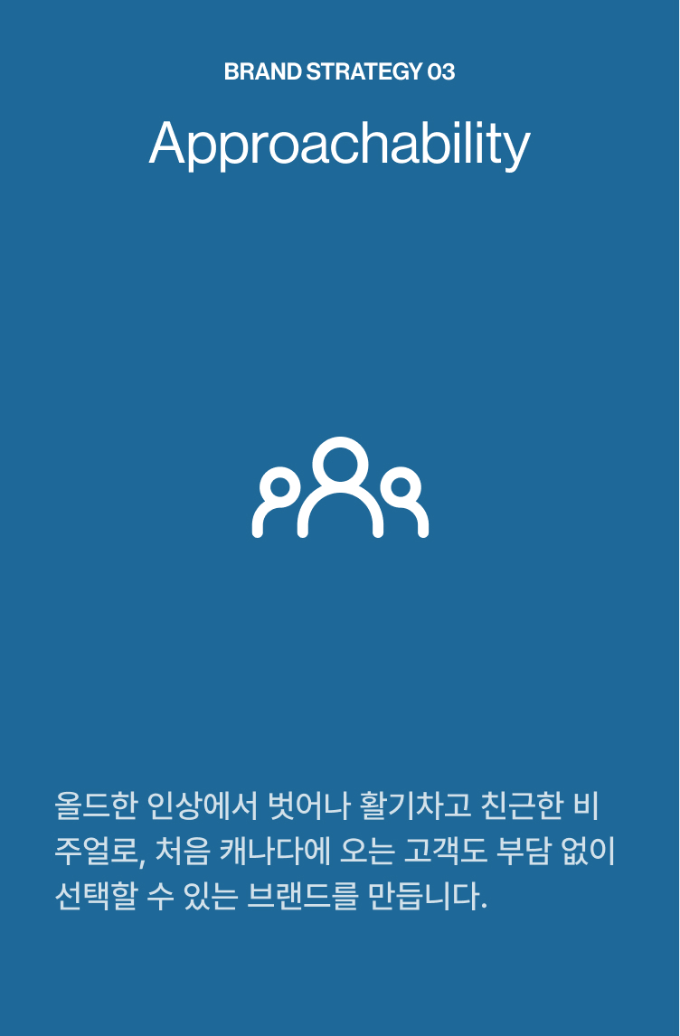
To strengthen PhoneBox’s visual and verbal identity, the brand strategy was built around three core principles: Clear Communication for instant understanding, Unified Experience for system-wide consistency, and Approachability for a more human, energetic brand tone. Together, these pillars reshape PhoneBox into a clearer, more cohesive, and more welcoming experience across every touchpoint.
PhoneBox의 브랜드 전략은 세 가지 핵심 원칙을 중심으로 수립했습니다. 누구나 즉각적으로 이해할 수 있는 명확한 커뮤니케이션 Clear Communication, 모든 채널에서 동일하게 작동하는 통합된 경험 Unified Experience, 그리고 보다 친근하고 활기찬 브랜드 인상을 위한 접근성 Approachability. 이 세 원칙은 PhoneBox가 어떤 접점에서도 일관되고 신뢰할 수 있는 브랜드로 자리잡을 수 있도록 모든 디자인 결정의 기준이 되었습니다.


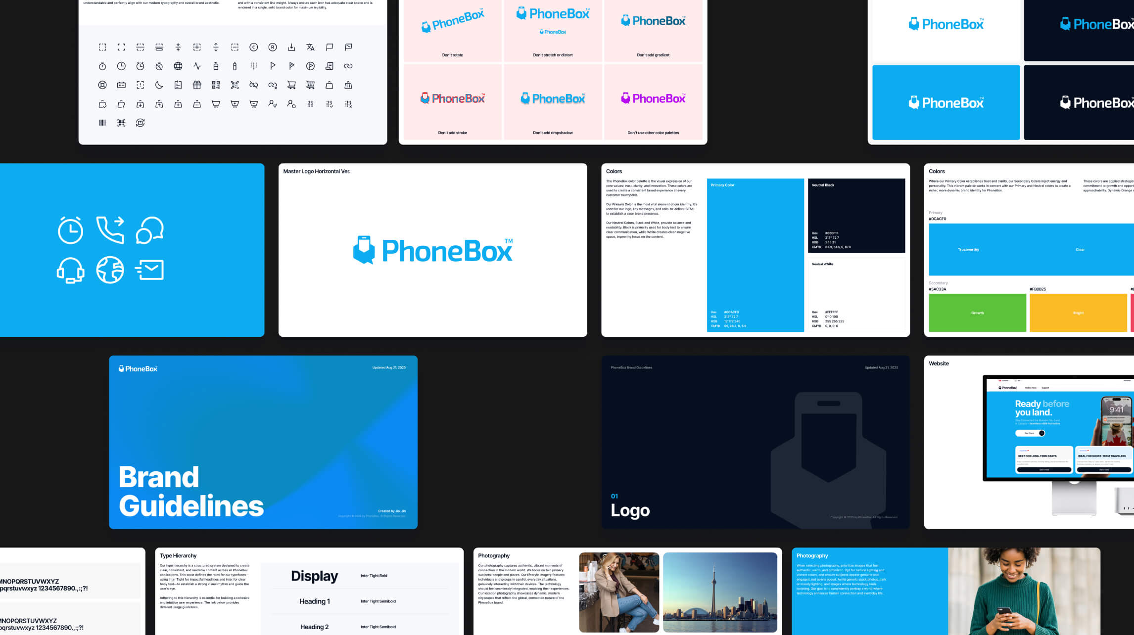
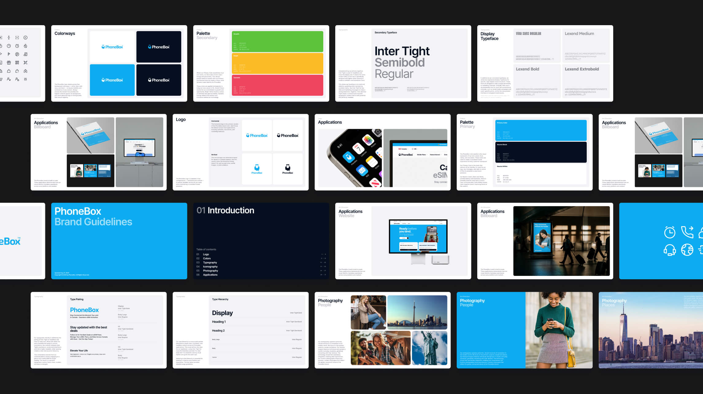
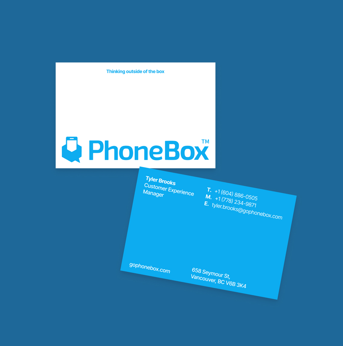
Logo Refinement
Strengthening the brand’s core mark for clarity and consistency
브랜드의 핵심인 로고, 더 정확하고 일관성 있게
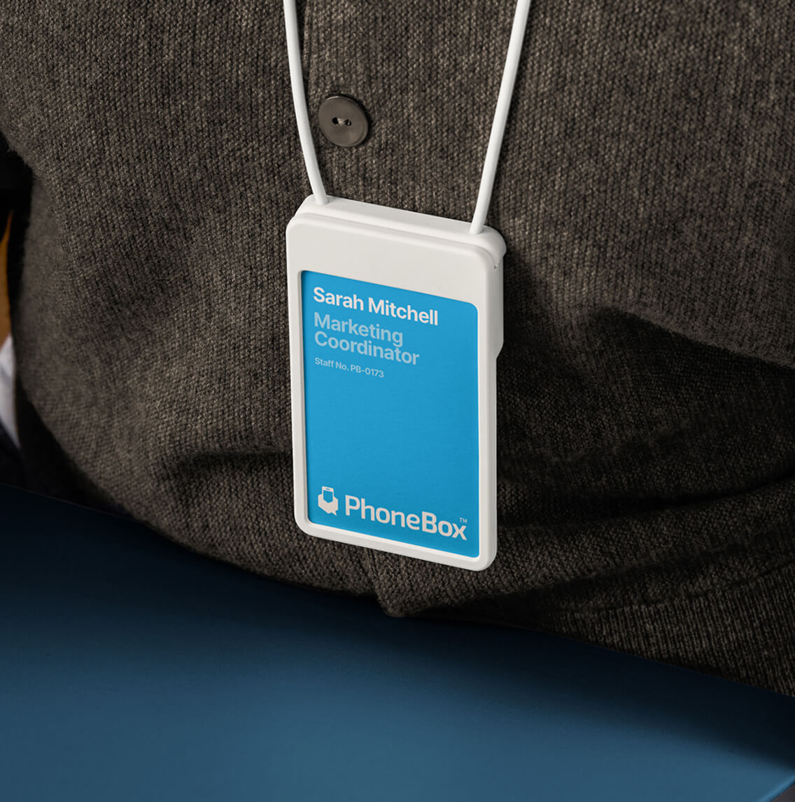
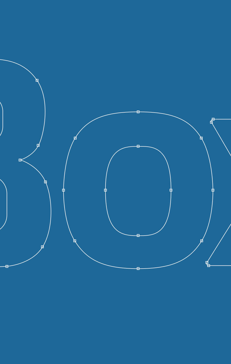
To resolve inconsistencies caused by outdated and unstructured logo files, the PhoneBox logotype was rebuilt and standardized across all formats (AI/SVG/PNG). Kerning and baseline alignment were refined to achieve visual balance, while subtle optical adjustments improved clarity in digital environments. The result is a cleaner, more reliable core mark that enhances the credibility of the entire design system.
관리되지 않은 구버전 파일로 인한 불일치 문제를 해소하기 위해, PhoneBox 로고타입을 다양한 포맷AI/SVG/PNG에 걸쳐 재정비하고 표준화했습니다. 자간과 베이스라인 정렬을 다듬어 시각적 균형을 확보하고, 디지털 환경에서의 가독성을 높이기 위한 섬세한 시각 조정을 더했습니다. 또한 기존의 로고 베리에이션 방식을 개선해, 심볼과 로고타입에 각각 다른 색상을 적용하는 방식으로 전환하여 브랜드 인식률과 가독성을 함께 높였습니다.
Primary
Blue
#0CACF0
Primary
Dark Blue
#1E6898
Secondary
Green
#5AC33A
Secondary
Yellow
#FBBB25
Secondary
Red
#EE445D
Black
#050F1F
White
#FFFFFF
Color System
Updating legacy colours for a younger, more energetic audience
더 젊고 선명하게, 그리고 확장을 고려한 컬러 시스템
To modernize PhoneBox’s visual presence, the core blue, navy, and green palette was refined with brighter, higher-contrast tones. The updated colours maintain the brand’s legacy identity while delivering a fresher look that resonates better with students and travellers — PhoneBox’s most active user groups.
기존 PhoneBox의 컬러를 유지하되, 주요 고객층인 유학생과 여행자에게 더 잘 어필할 수 있도록 채도를 높여 전반적으로 생동감 있는 팔레트로 개선했습니다. 또한 캐나다 시장의 메인 컬러를 기반으로, 향후 미국·남미 등 신규 시장 진출을 고려한 확장 컬러를 함께 정의했습니다. 각 컬러는 메인 컬러와 채도·명도를 맞춰 선정하여, 시장이 달라져도 브랜드의 시각적 일관성이 유지될 수 있도록 했습니다.

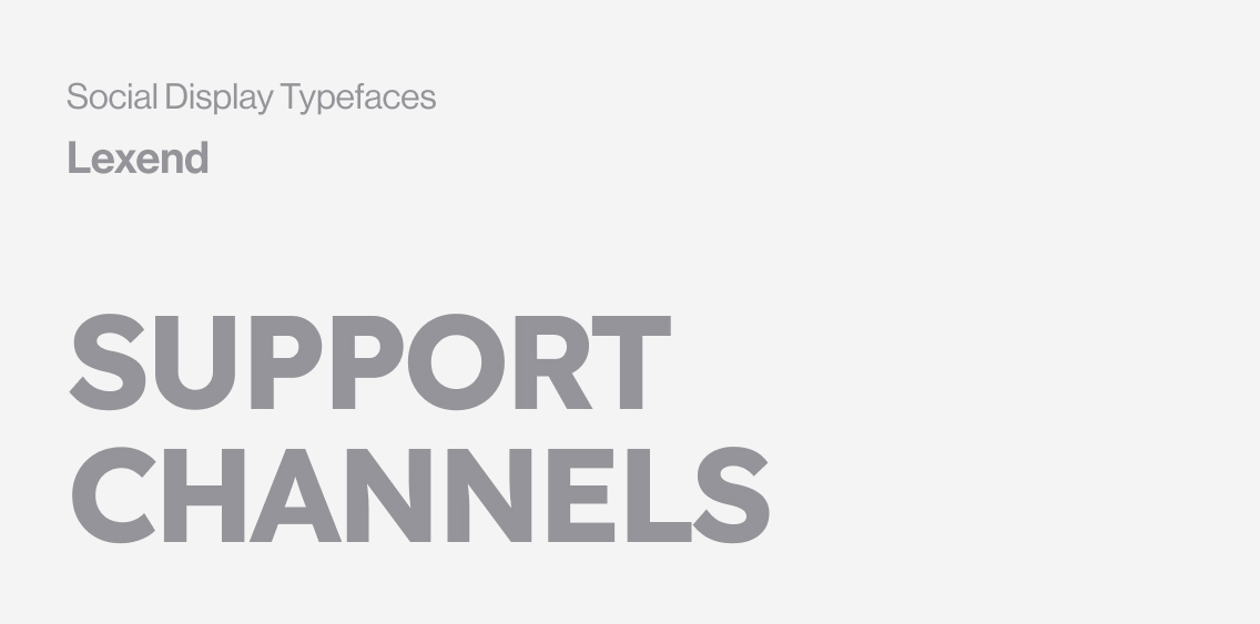
Typography
A streamlined system built for clarity and consistency
가독성을 중시하면서 메시지를 강하게 전달하는 서체 시스템
PhoneBox uses a paired typographic system designed to keep communication clean and accessible. Inter delivers high readability for all body copy, while Inter Tight provides a sharper, more expressive voice for headlines. This combination creates clear hierarchy across every touchpoint without adding visual noise.
For social media communication, two additional display typefaces introduce flexibility and personality. These fonts are reserved exclusively for high-impact posts and promotional visuals, ensuring the core brand identity remains consistent across product and service touchpoints.
PhoneBox의 타이포그래피는 명확한 위계와 가독성을 중심으로 구성했습니다. 본문에는 PhoneBox의 주된 커뮤니케이션 플랫폼인 디지털 환경에 최적화된 Inter를, 헤드라인에는 강하고 직접적인 메시지 전달에 적합한 Inter Tight를 사용해 브랜드 전반에 걸쳐 깔끔하고 일관된 인상을 만들었습니다. 소셜 미디어 콘텐츠에는 별도의 디스플레이 서체를 추가해 유연성과 개성을 부여하되, 핵심 브랜드 접점에서는 기본 서체 시스템을 유지해 정체성의 일관성을 지켰습니다.
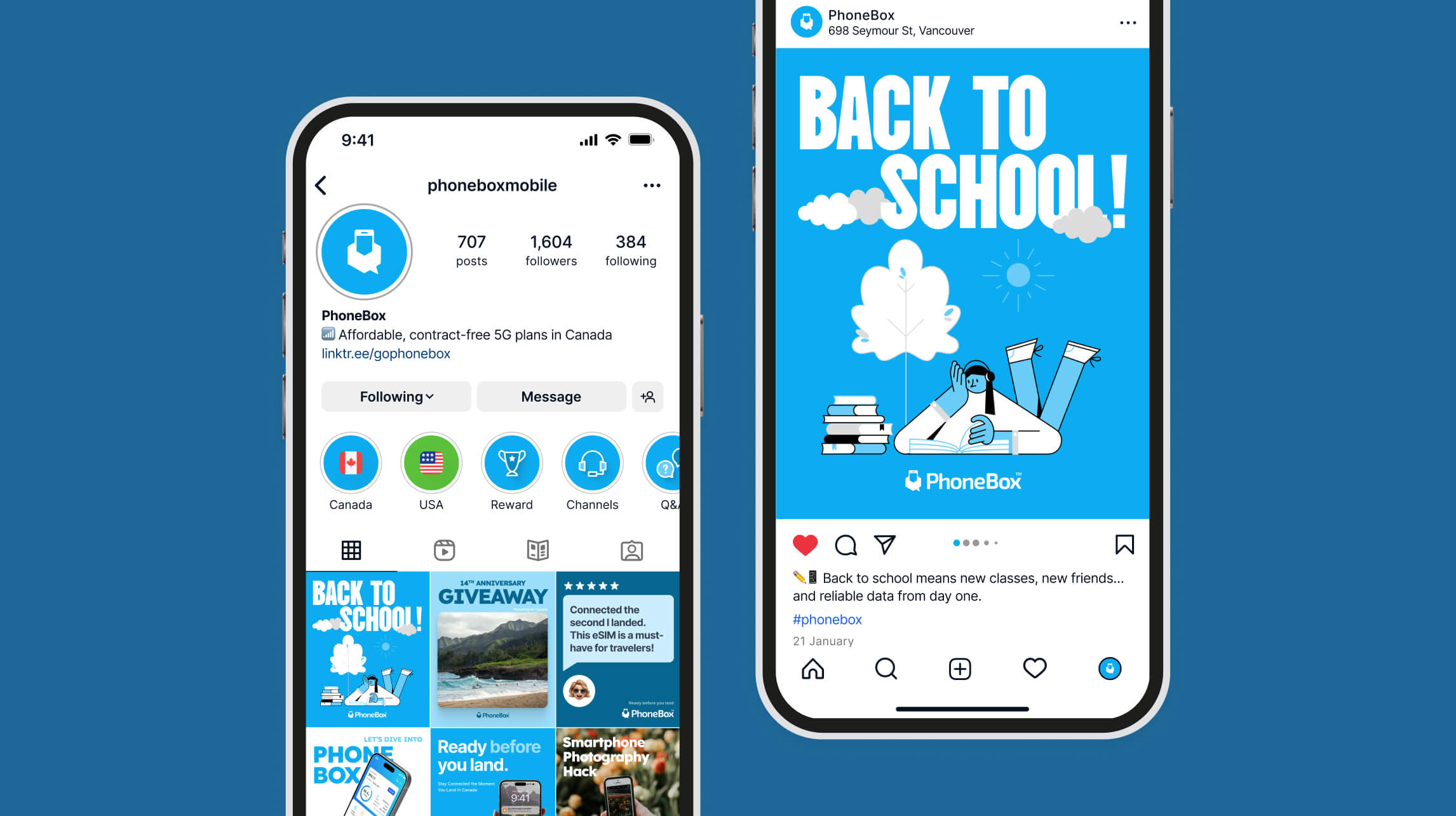
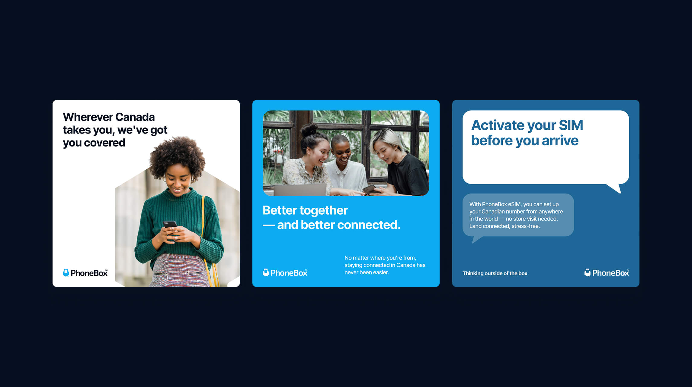
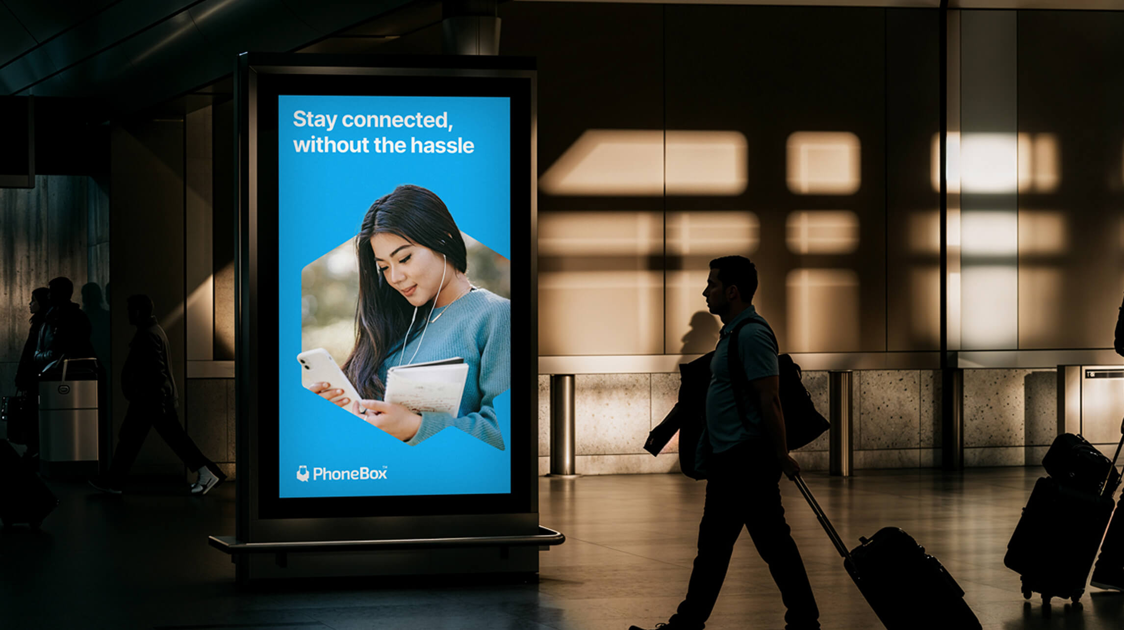
Social Media Communication
Establishing a clear visual standard across all channels
채널 전반에 걸친 명확한 비주얼 기준 수립
PhoneBox had no defined rules for typography, imagery, or colour usage on social media, resulting in mixed styles across posts. I consolidated the scattered assets and set practical guidelines for type, photo selection, and colour ranges, enabling the team to produce consistent, on-brand content across all digital channels.
기존 PhoneBox의 소셜 미디어 콘텐츠는 서체·이미지·컬러 사용에 명확한 기준이 없어 게시물마다 스타일이 달랐습니다. 분산된 리소스를 정리하고 사진 선택 기준, 컬러 사용 범위, 서체 규칙을 정의해 팀 누구나 일관된 콘텐츠를 제작할 수 있는 실용적인 가이드라인을 마련했습니다. 또한 개별 캠페인에는 캠페인 성격에 맞는 별도 서체 사용을 허용하여, 브랜드 일관성을 유지하면서도 각 캠페인이 고유한 개성과 확장성을 가질 수 있도록 했습니다.
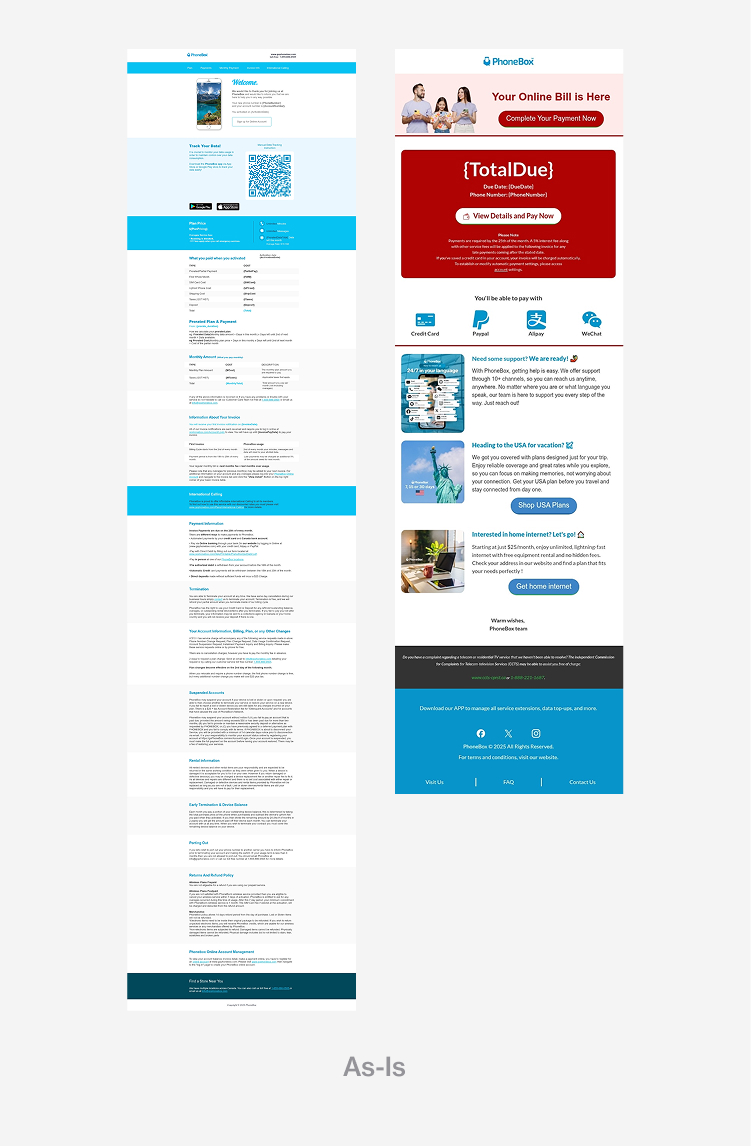
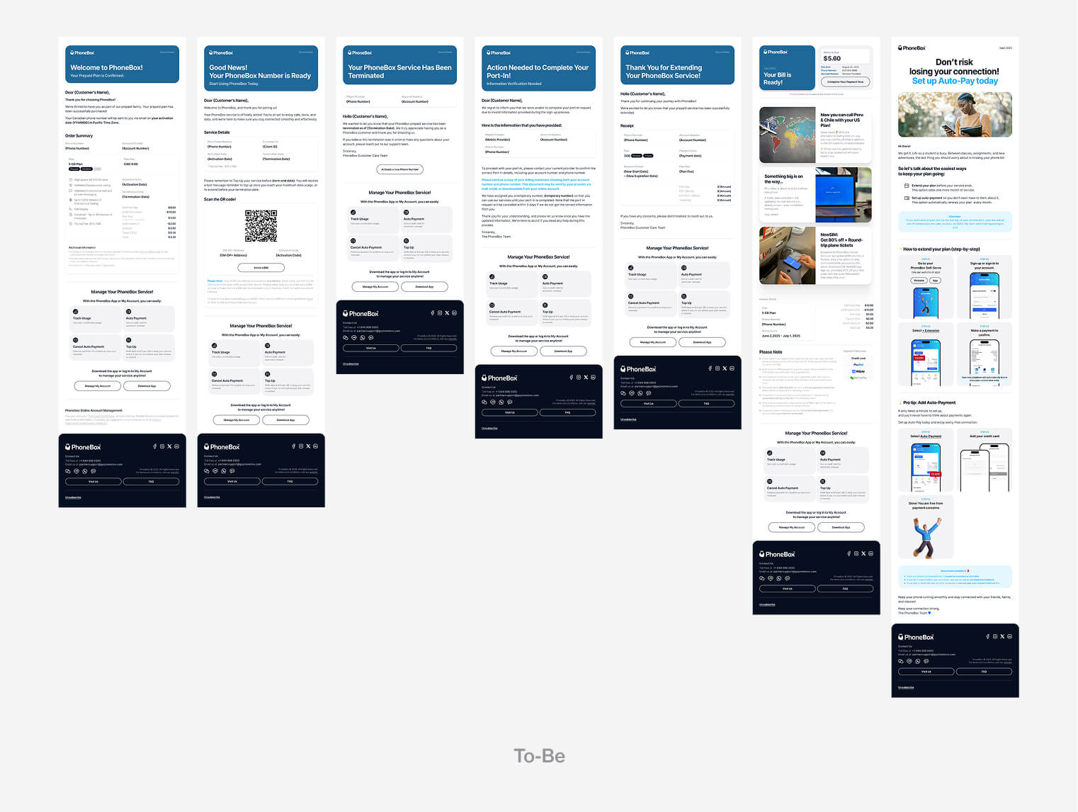
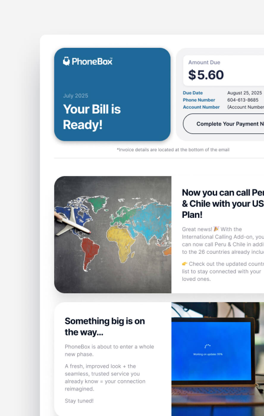
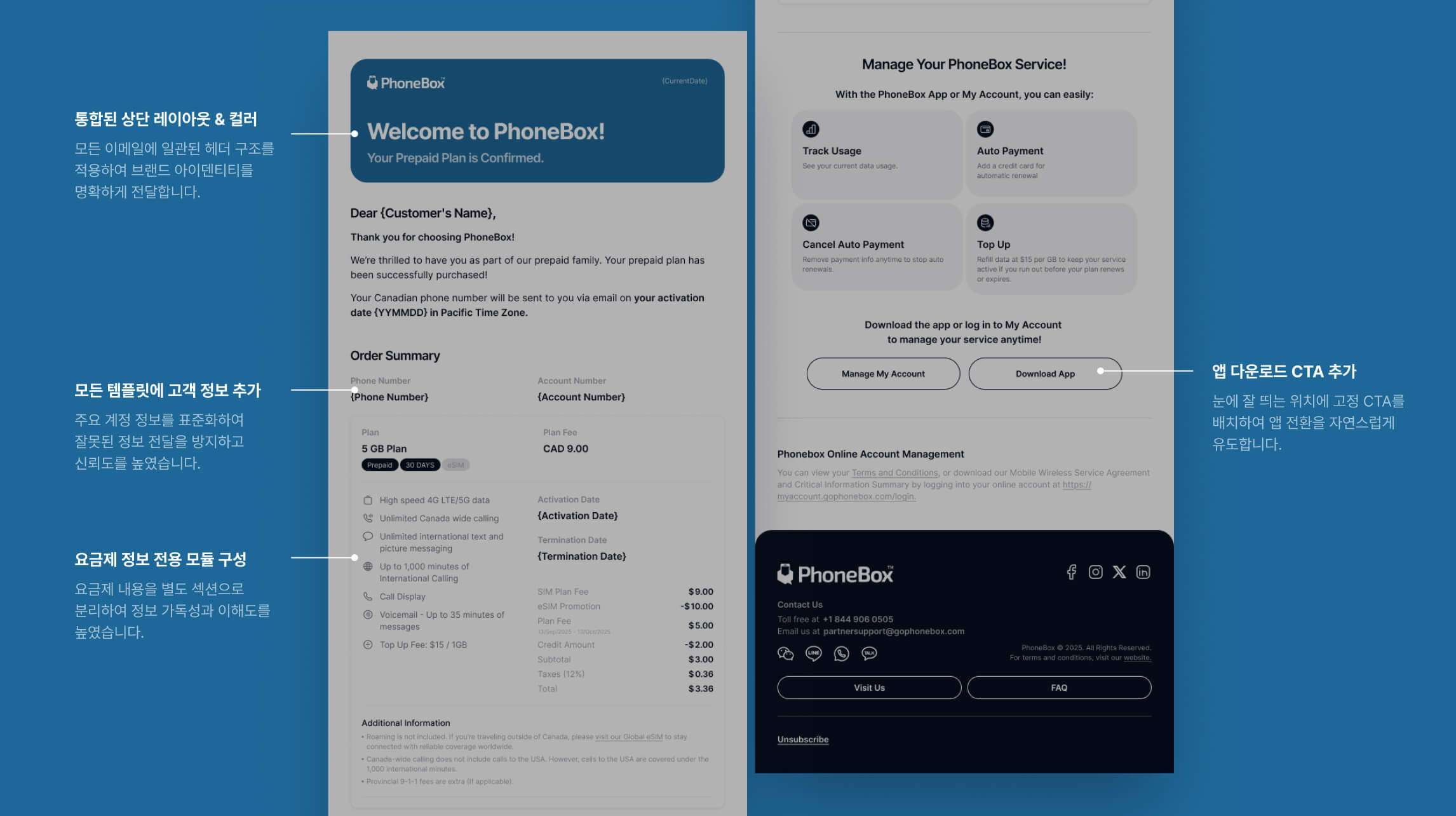
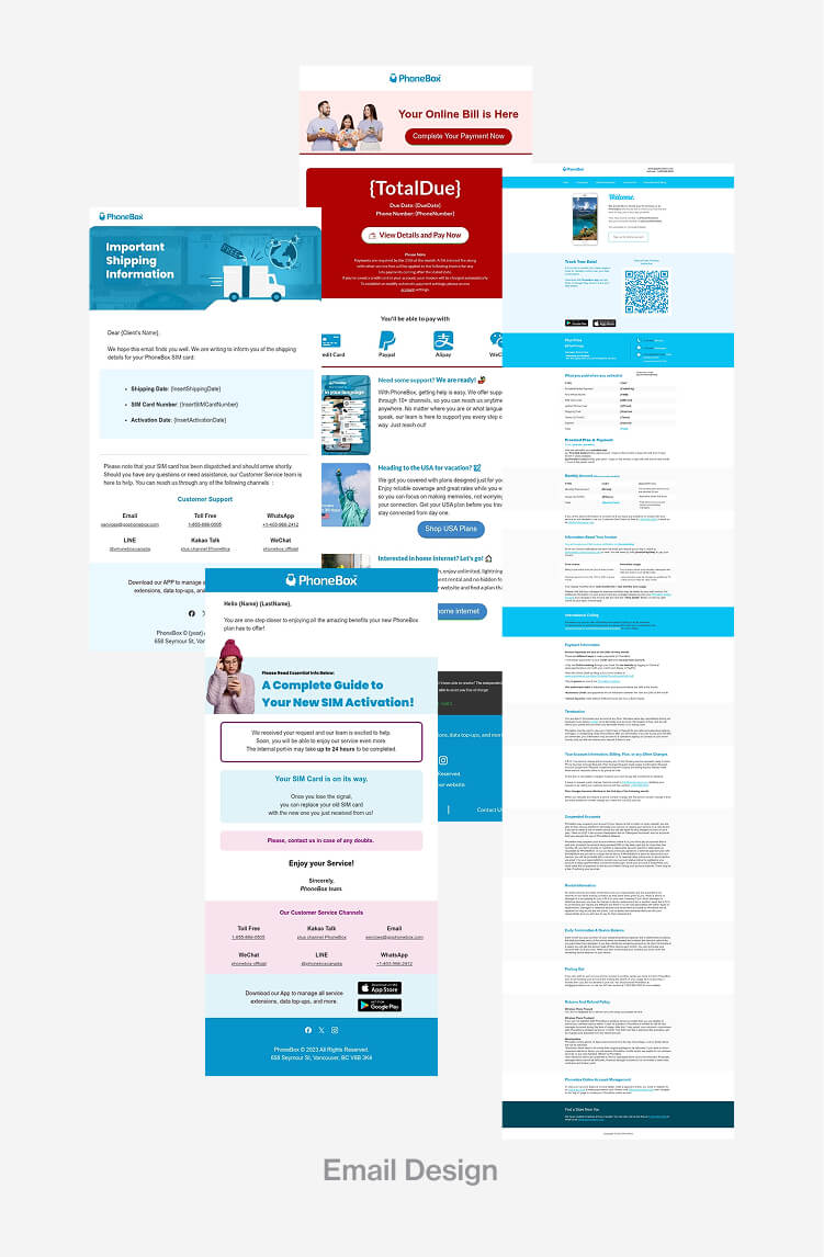
Email Design System
Creating a consistent, user-focused email experience
사용자 중심으로 재설계한 이메일 경험
All service emails were redesigned under a unified structure, aligning visuals and messaging across the entire user journey. Missing information was clarified, frequently-asked details were reorganized, and responsive layouts were introduced for seamless readability. This consolidation strengthened clarity and built a more reliable, cohesive brand experience.
모든 서비스 이메일을 통합된 구조로 재설계하여 전체 사용자 여정에 걸쳐 일관된 비주얼과 메시지를 전달할 수 있도록 했습니다. 누락된 정보를 보완하고, 자주 문의되는 내용을 우선순위에 맞게 재배치했으며, 반응형 레이아웃을 도입해 어떤 기기에서도 읽기 편한 구조를 만들었습니다. 이를 통해 브랜드 신뢰도를 높이고 보다 응집력 있는 고객 경험을 구축했습니다.

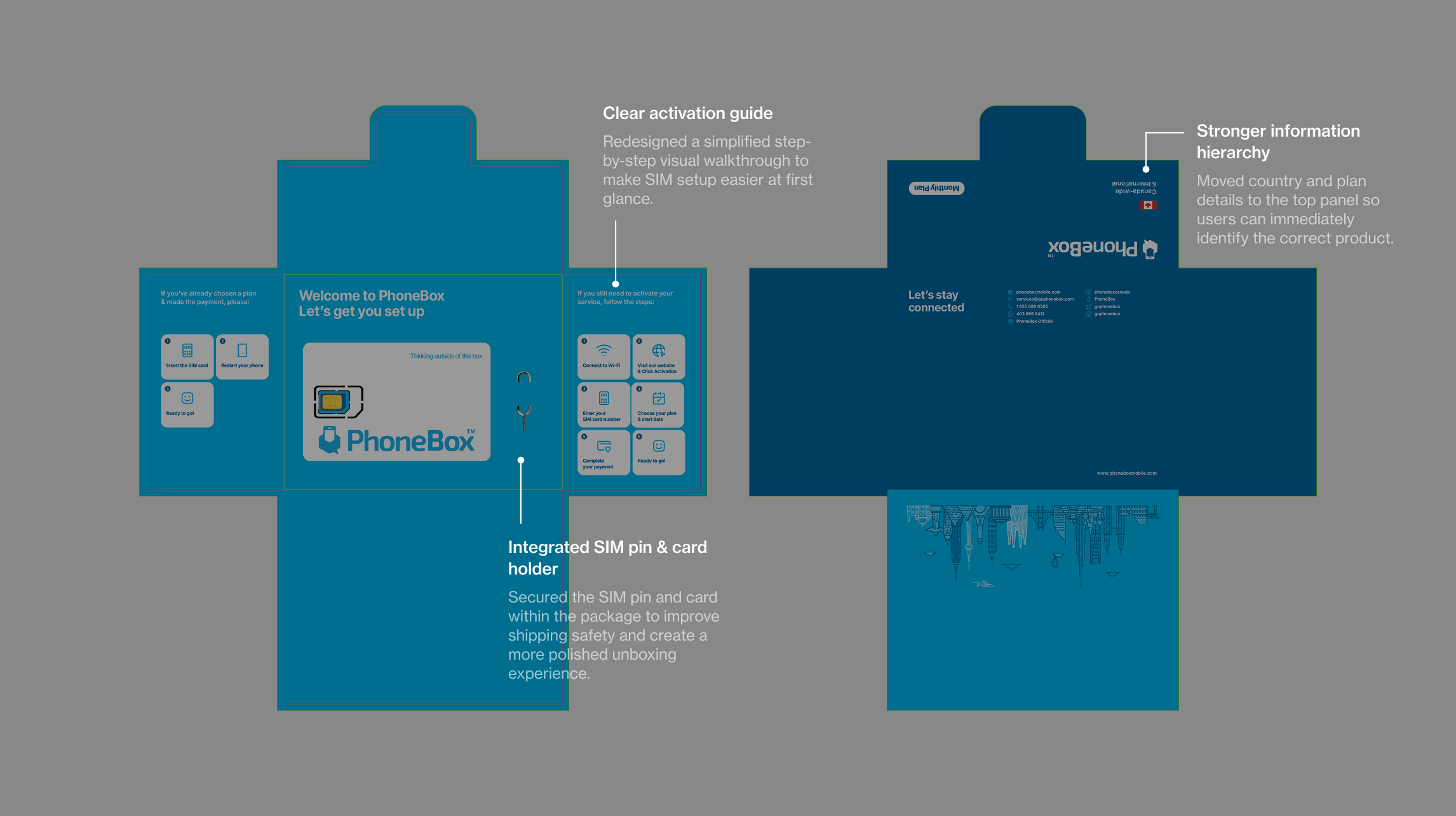
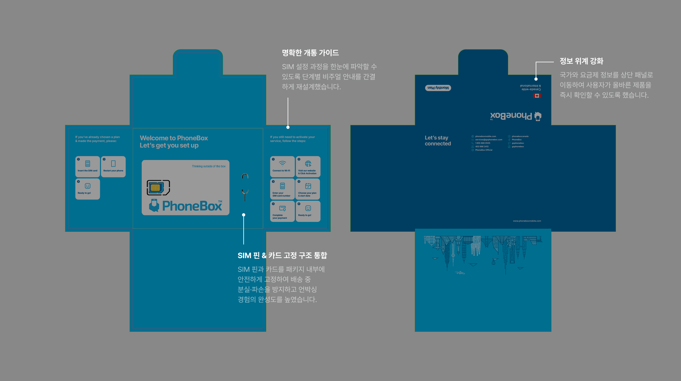
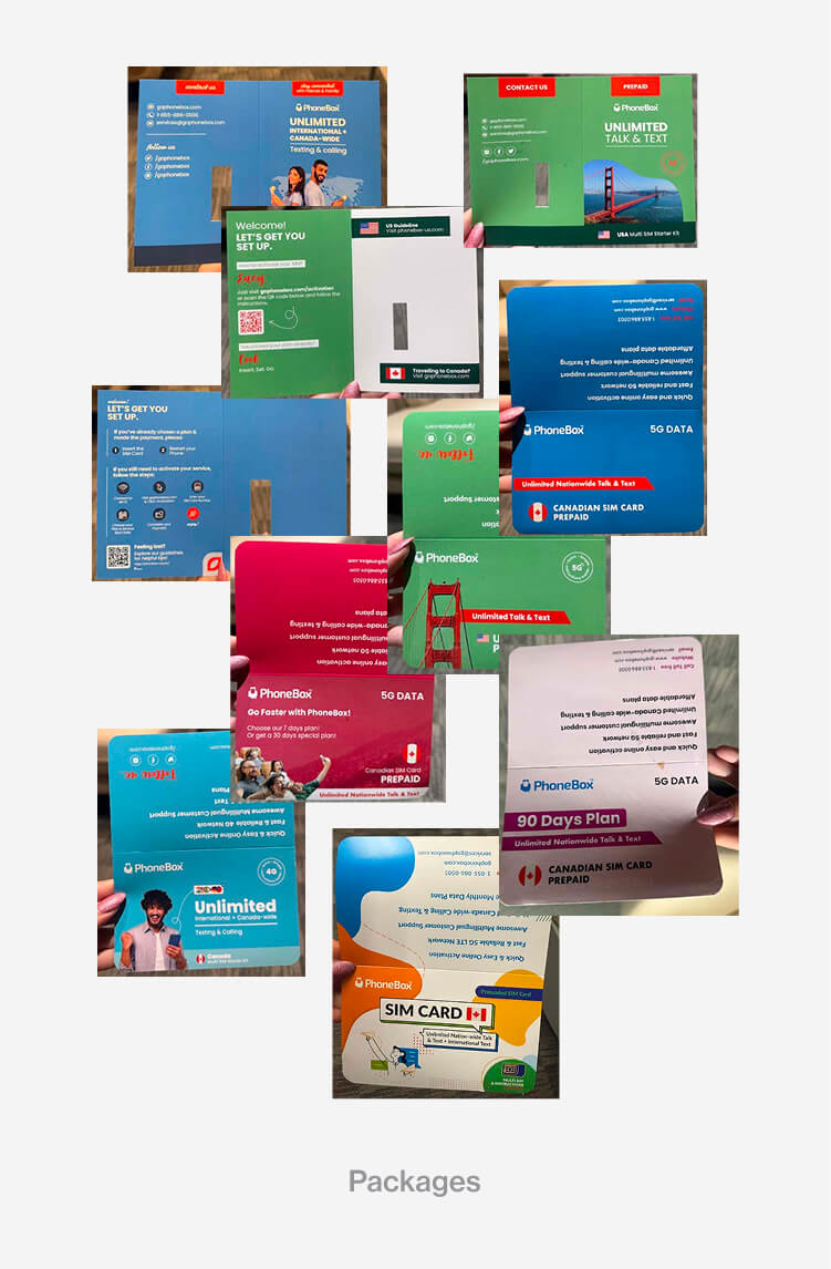
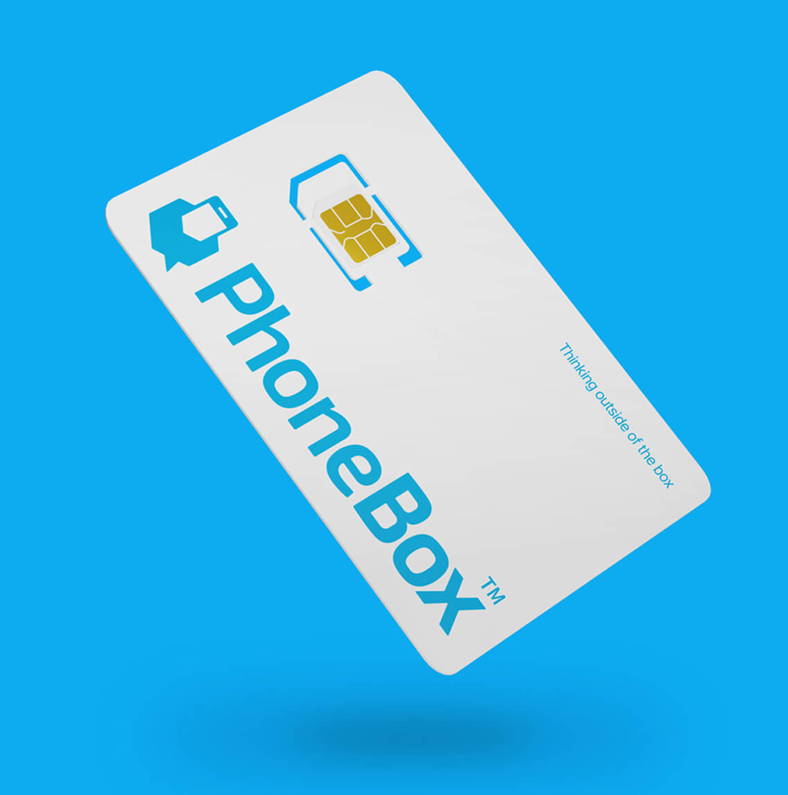
Packaging System
Creating a clear, unified unboxing experience
어느 제품에서나 일관된 제품 경험
To eliminate fragmentation across regions, all package formats used in Canada, the U.S., and Amazon were consolidated into one cohesive system. Product information was reorganized into a clear hierarchy, helping users immediately understand what they purchased. The structural format was also upgraded from a simple folded card to a design that securely holds the SIM pin and SIM card, improving protection during shipping and elevating the unboxing experience.
캐나다·미국·아마존 등 유통 채널별로 분산되어 있던 패키지 포맷을 하나의 통합 시스템으로 정리했습니다. 제품 정보를 명확한 위계로 재구성해 사용자가 구매 내용을 즉시 파악할 수 있도록 했으며, 기존의 단순 접지 카드 형태에서 SIM 핀과 SIM 카드를 안전하게 고정할 수 있는 구조로 개선해 배송 중 파손을 방지하고 언박싱 경험의 완성도를 높였습니다.
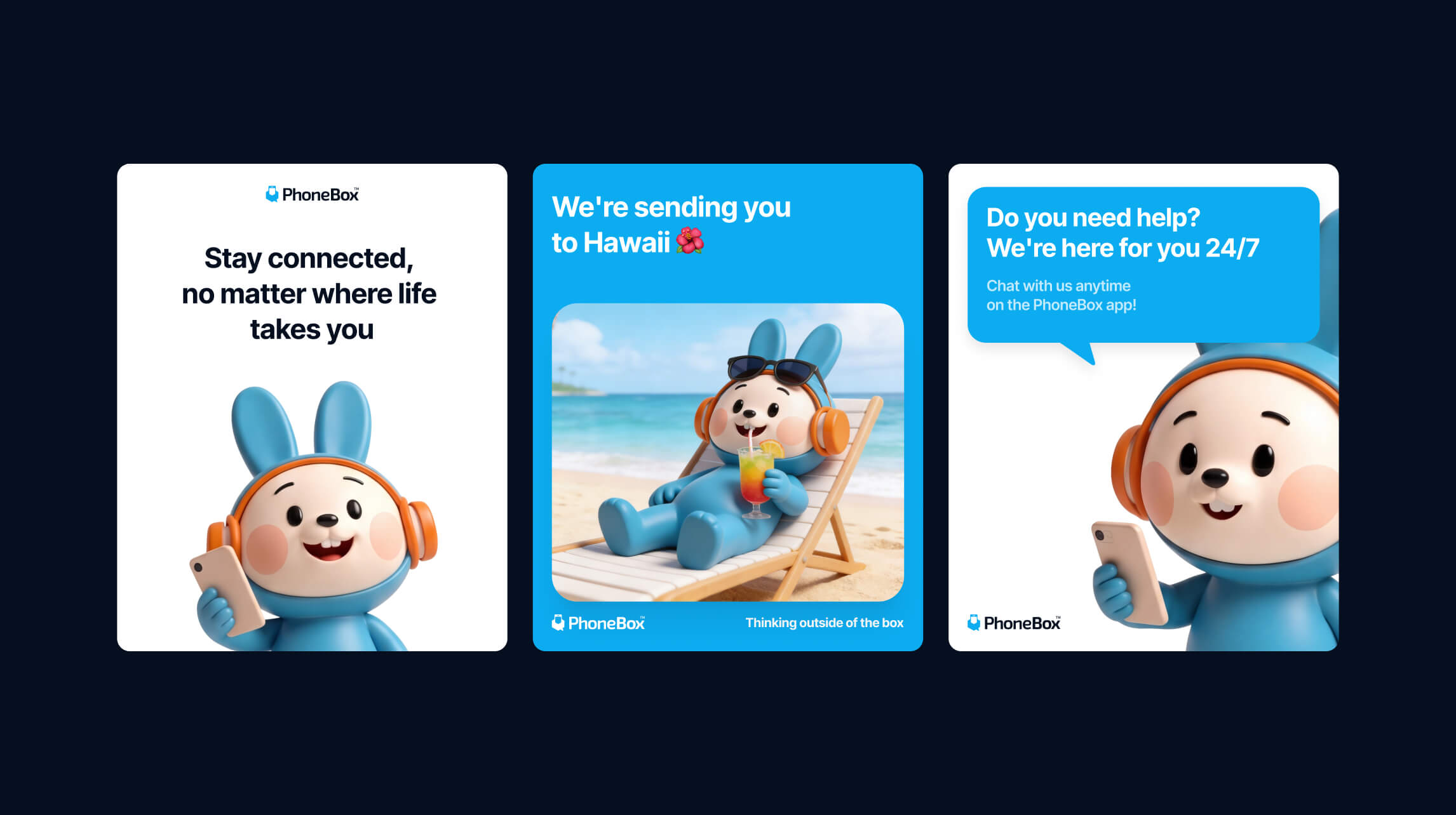
Character Design
Building a character system in 2D and 3D
팀 전체가 함께 쓸 수 있는 캐릭터 시스템 구축
The character system was designed not just as a visual asset, but as a scalable resource for the wider team. Starting from 2D sketches, AI tools were used to accelerate the 3D development process — iterating on forms and expressions efficiently. To ensure consistency and extend usability, a prompt guideline was developed alongside the assets, allowing social media managers and designers to independently generate on-brand character imagery without starting from scratch each time.
캐릭터 시스템은 단순한 비주얼 에셋을 넘어, 소셜 미디어 담당자와 디자이너가 독립적으로 활용할 수 있는 확장 가능한 리소스로 설계했습니다. 2D 스케치를 바탕으로 AI 툴을 활용해 3D 전환 과정을 효율화하고 형태와 표정을 빠르게 반복 검토했습니다. 일관성 유지와 활용 범위 확대를 위해 프롬프트 가이드라인도 함께 제작하여, 매번 처음부터 시작하지 않고도 브랜드 톤에 맞는 캐릭터 이미지를 생성할 수 있는 환경을 만들었습니다.